

Watercolor is experiencing a renaissance as artists redefine what they bring to this timeless medium. Its immediacy and intimate aspects teach us to appreciate its spontaneous qualities. Transformative watercolor layering techniques create the most stunning washes, layers, and ultimately, visual narratives.
The Orlando Museum of Art’s (OMA) current exhibition, the Florida Watercolor Society’s 54th Annual Exhibition, “To Catch A Dream”, embraces an energetic variety of the medium as something to be appreciated and understood. An exclusive selection of 100 works from this juried exhibition showcases what artists can do with water on paper to create unforgettable experiences.
Matthew Bird, a nationally recognized watercolor artist, is the distinguished juror of this year’s exhibition and naturally brings a unique perspective to both those learning how to appreciate watercolor art and those honing their craft to master the medium.
The storytelling quality of this exhibition and its multifaceted approach will inspire visitors through the aesthetic beauty and energy of the space where artists have truly pushed the boundaries of watercolor.
The Magic of Transparency in Watercolor
The defining property of fine art watercolor, above all else, is transparency. Transparent pigments allow light to pass through the painted film to hit the bright white of the paper and bounce back to the viewer’s eye in what so many artists refer to as the “signature glow” of the watercolor medium.
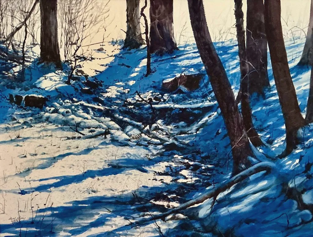
This light-through-color attribute is present in many pieces selected by the Florida Watercolor Society (FWS). For instance, Xi Guo’s Luminous (2019) creates luminosity as the focus of the piece, while Joe Cibere’s Backlight (2023 Exhibition) indicates transparent washes stacked over each other to render the warm receding light of the day.
Subjects that are naturally transparent, such as water, sky, and reflective surfaces, also appear regularly in FWS exhibitions. For example, Kathy Simon-McDonald takes a transparent approach with Playin’ Sweet Jazz (2015), wherein transparent layers of color suggest atmosphere, reflection, and pulses of energy without overtly opaque applications.
Transparency is dependent upon pigment and formulation. Most professional brands will indicate whether a color is transparent, semi-transparent, semi-opaque or opaque. As Artists Network points out, using transparent pigments (and knowing when to blend them with semi-transparent colors) is the secret to achieving layered depths without compromising light.
Professional organizations like the Florida Watercolor Society and experienced educators note time and again that pigment transparency and paper brightness are the leading factors for watercolor luminosity. This level of skill will be apparent throughout the Florida Watercolor Exhibition.
Visitors will see skies glowing from within, glints of glass and water, and portraits that live and breathe. It’s a type of magic that relies upon the right pigment, amount of water, paper texture, and speed.
Layering and Luminosity: The Art Behind the Technique
Often, watercolor’s transparent painting techniques occur through glazing: the application of thin, transparent washes to dried areas so that color and value accumulate over time without a muddied appearance. As Jackson’s Art Supplies highlights, each layer is unique in that it tempers a tint, darkens a wash, or softens an edge.
Glazing also simulates more strength of optical mixes than mixtures created with puddles on the palette. This requires students to discover patience (as each layer must dry), control (too much water can create blooms), and differences between brushwork (softer, responsive hairs negate edges).
You will also note where wet-on-wet is present, as pigments bloom into a wet application for atmospheric or motion-based renderings or dry-brush applications for detailed impressions on textured paper. Many instructors teach a printmaker’s approach to application: intentions from light to dark, built-in highlights, and reliance on the paper for luminosity.
These transparent painting techniques are what teachers hope to cultivate in their students, and they’re apparent throughout the exhibition. In Laura Robinson’s Jet Stream, a shrimp boat rests under a sky of layered overlaps; trees in the background disperse into washes, the hull’s layered glazes and lifted/splattered details replicate the light of the sun dancing across the water and the metal of the vessel.
In Anne Abgott’s A Date with Craig, palm fronds overlap each other seemingly rendered from open air as they employ consistent glazes and negative painting. Warm and cool layers create form but also leave the paper white from within. This demonstrates how applied whiteness accumulates for a deeper value without losing luminous watercolor effects.
Florida Watercolor Society’s Legacy in Fine Art
Since its inception over half a century ago, the Florida Watercolor Society has promoted the status and advancement of fine art watercolor through juried exhibitions, workshops, and programs across the state.
To have one’s work selected for the Annual Exhibition is a true testament of artistry and vision. The 54th Annual Exhibition showcases the best of the best in one location, the Orlando Museum of Art.
This year’s juror is Matthew Bird (AWS, NWS, TWSA), a watercolor artist known nationally for his technical accuracy and glowing realism, an acknowledgement of his judging, exhibition selection, and teaching experience at the FWS Convention.
The exhibition is more than just an opportunity to view galleries of stunning art in one location; FWS programming features a juror demo and opening reception at OMA to promote community engagement and the educational element of the show.
Appreciating Watercolor as a Viewer
If you’re curious about gaining a deeper watercolor art appreciation in person, here are a few tips on viewing art like an expert while still maintaining that sense of wonder:
- Acknowledge transparency: Look for places where the paper’s white shines through layers of color; if the shadows appear “lit”, you’ll see transparent pigments.
- Recognize layers: Can you detect an initial wash that is lighter than the next layer of glaze applied? Clean edges and transitions with slight differences are often markers for layers that dried completely before the artist returned.
- Understand the water: Soft, feathered edges tend to indicate wet-on-wet; crisp edges and broken brush strokes often mean a dry brush was used. Where do you see these approaches applied and to what advantage?
- Acknowledge the paper: The texture of the paper (smooth hot press or bumpy cold press) and internal treatment (sizing) essentially controls how your paint will settle (granulation) or create unintended watermarks (blooms) and how easy it is to lift color.
- Note the journey: Even in an abstract work, a visual flow can exist based on value and color temperature. Why should I look here first, and how do you keep my eyes on the page?
Are you a watercolor novice? Practical considerations for glazing properties, pigment properties, and surface choices will make excellent references before and after your gallery visits and help you grasp more watercolor techniques for beginners.
Experiencing the FWS Exhibition at OMA
To Catch a Dream: Florida Watercolor Society 54th Annual Exhibition is at OMA from September 13, 2025, to January 4, 2026, and presents 100 breathtaking watercolor works chosen from over 500 entries by juror Matthew Bird that span styles and subjects, all connected by the medium’s transparent painting techniques.
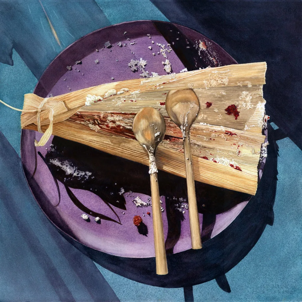
From still lifes to expansive skies, works like Jet Stream by Laura Robinson, It Was So Good by Kathy Simon-McDonald, and Breakfast Reunion by Joan Lok represent the topical and technical diversity and dexterity of contemporary watercolor work in Florida.
The OMA galleries are staged for watercolor art appreciation and discussion. Well-placed sightlines, suggested pacing, and optional interpretive labels make watercolor layering techniques and luminous watercolor effects like glazing, wet-on-wet sections and lifted highlights discernible between multiple works.
Small seating areas give guests time with their favorite pieces while guided experiences and programming allow visitors to better articulate what they see for practical learning, a must for students, teachers and lifelong learners looking to develop their watercolor eye.Curious to see the “light-through-color” effect for yourself? Plan your visit during the run of the show to compare surfaces, depths, and edges for all 100 works. With a new appreciation for transparency, timing, and the luminous watercolor effect, you’ll never look at fine art watercolor quite the same way again!